- 21 March 2023, 08:45 AM
Color match perfectly to impress your customers
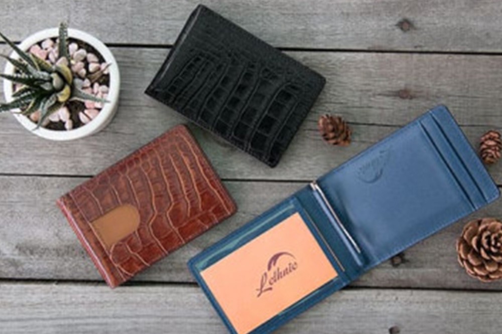
Color Match Perfectly to Impress Your Customers
Your brand’s identity begins with color. From the first click to the final conversion, your color scheme plays a vital role in how customers perceive your business. Consistent, professional color matching ensures visual harmony across all touchpoints—creating trust and enhancing user experience.
Why Is It So Important?
A well-chosen color palette grabs attention and builds emotional connections. Whether you're designing a website, product, or marketing campaign, the right colors help guide visitors and improve readability. They bring order to your layout, reinforce your brand message, and boost customer engagement—without saying a word.
Where Does Color Psychology Come In?
Color theory isn't just creative guesswork—it's backed by science. Decades of research show that colors influence perception, trust, and behavior. For instance, blues build confidence, reds ignite action, and greens promote calm. Understanding the psychology behind your palette allows you to design intentionally, not accidentally.
Conclusion
Perfect color matching isn’t a trend—it’s a necessity. It bridges design and function, ensuring your message is not only seen, but felt. When done right, your colors do more than look good—they leave a lasting impression.
Share This
Latests

Unlocking Digital Growth: Your Success Map
04 March 2024, 07:51 AM
Agency Amplified: Igniting Your Potential
04 March 2024, 07:50 AM
Photoshop Create Path From Image.
28 March 2023, 06:52 AM
Color match perfectly to impress your customers
21 March 2023, 08:45 AM